
We believe that art practice integrated with the exploration of letterforms (and a little humour) can provoke a refreshing wave of display typography. Rubin Sans is a font that has been developed throughout the works of the artist Honza Zamojski for several years: in drawings, murals, sculptures and art books. Initially, Honza's letters had an important feature – they had to be easy to draw with a ruler and draftsman curve. Individual letters and pictograms were created for subsequent artistic projects, while their shapes and proportions evolved during the digitization of the font.
An essential part of the font is a set of pictograms, which originate in the author's drawings and create a parallel visual language – susceptible to many interpretations and applications. The characteristic and original set is made available as a democratic creative tool, thus opening the next stage in the life of the Rubin Sans font.
Font design: Honza Zamojski
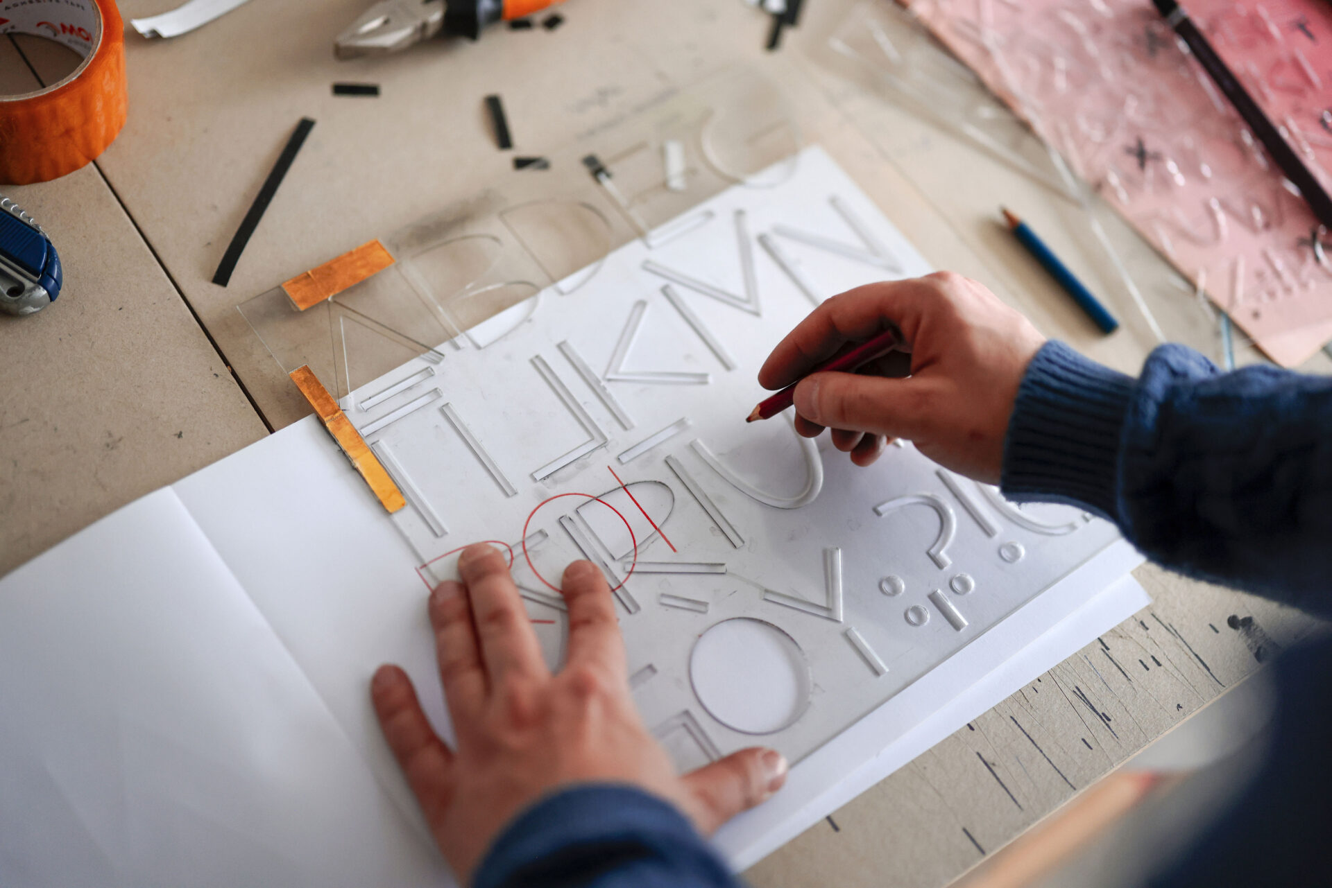
A primary source of Rubin Sans – a plastic stencil tool created by Honza.

The potential of Rubin Sans’s letters was and is most often used in Honza’s drawings; the letters’ proportions facilitate work on grids.

The letters of the Rubin Sans font perform in public spaces, on a larger scale and in the context of architecture. This is documentation of the “WORD WAR FREE” exhibition at the LETO gallery in Warsaw in 2018. [Photo. Bartosz Gorka]

The cover of the book LOVE LETTER (onestar press, Paris 2017).
The simplicity of the letter construction means that the larger the font, the better the compositions.

One of the first versions of the Rubin Sans font as a typographic portrait, i.e. NOSE, EARS, EYES [Photo. Bartosz Gorka]

Honza at his studio. Poznań 2023