Tor grotesk arrives from the railway tracks and train depots. The design follows the strict geometric doctrine of DIN's typographic family of fonts initially developed for industrial uses. Our interpretation and adaptation of this functional fonts category carry heavily slanted weights (also exist as a Variable font version where the angle of italic could be adjusted). Tor grotesk was primarily designed for a book about radical train enthusiasts and the world's longest produced electric train. This project is more than the 500 pages book recently published by Torypress (and copublished by us). The authors spent four years travelling around Poland, interviewing passionate spotters, graffiti writers, model makers, photographers, painters, train drivers. This diverse community often have a clashing point of view but share a love for this same object. You will find in this book new content which has never been published until now from private and neglected archives. You can examine the function and style of Tor grotesk in the titles and other display elements of the graphic design solutions and layout of Radical Passion book.
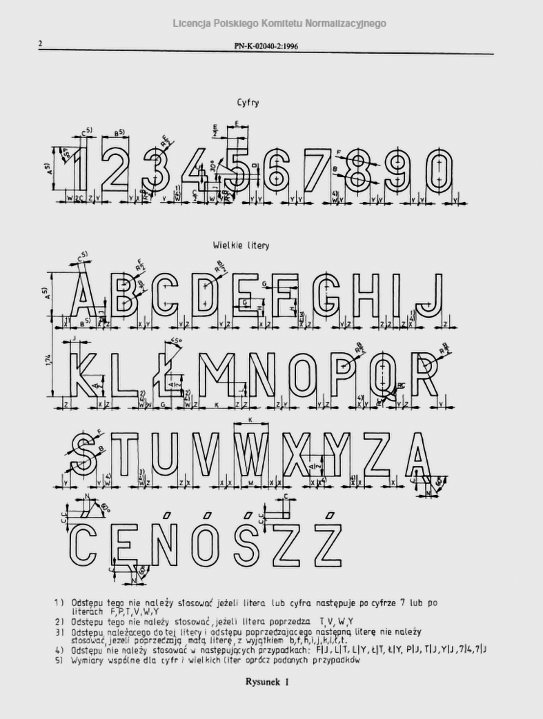
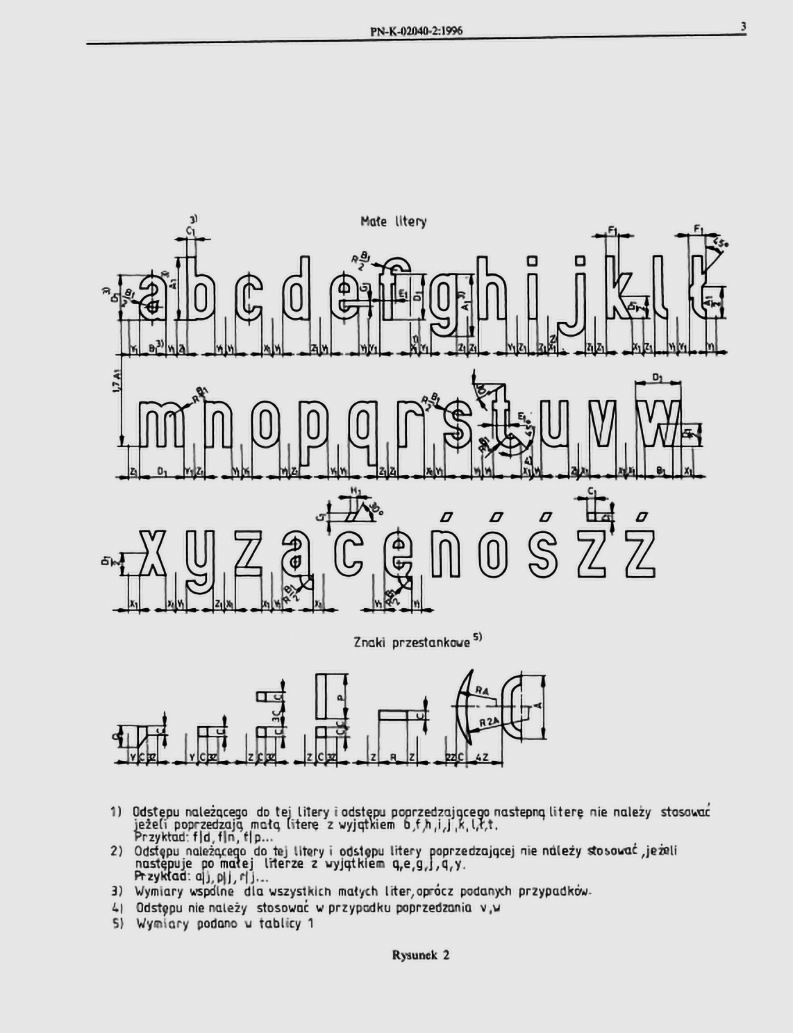
Norms defined by the Committee for Standardization, describing modern lettering on railways used after World War II, 1990s, Poland.

Specimen of letterforms, numbers and inscriptions on trains, 1930s, Poland.
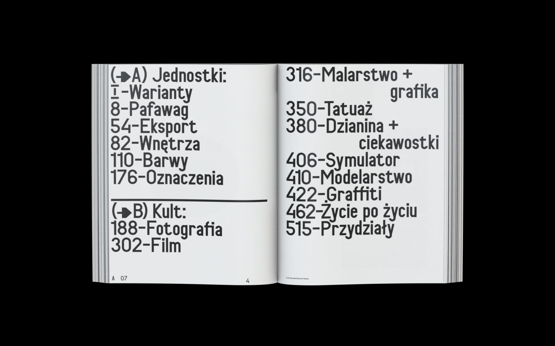
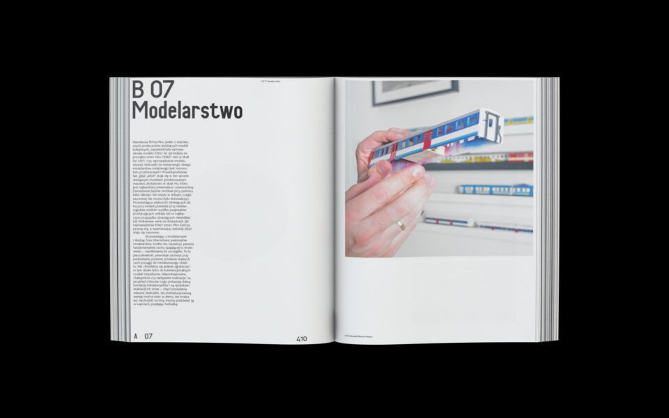
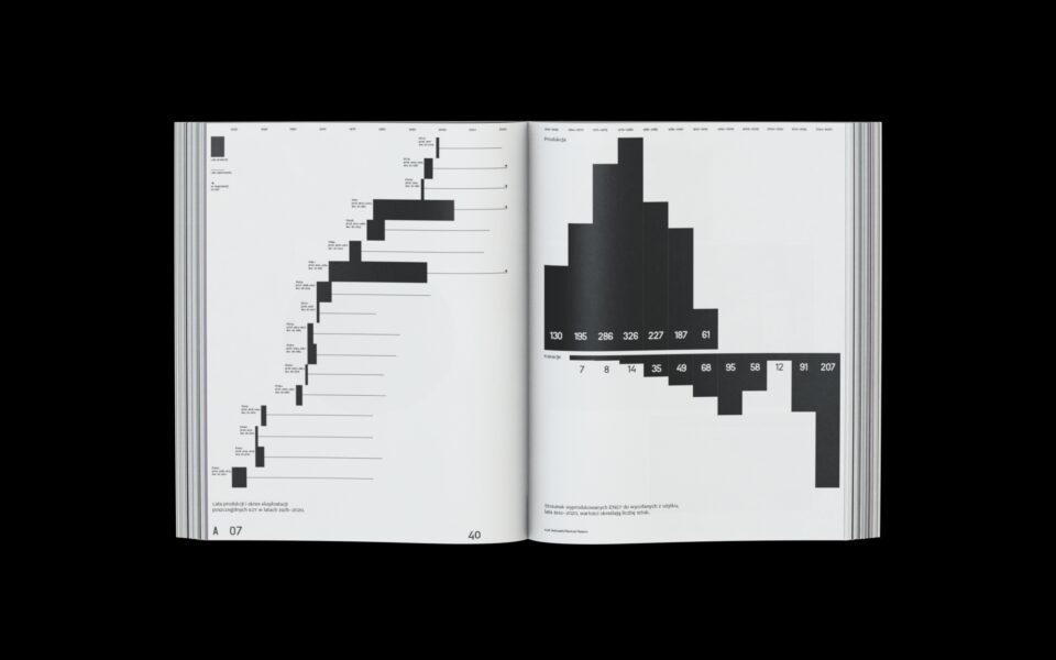
Spreads from Kult Jednostki/Radical Passion book with Tor grotesk in use.